The footer section of a website often receives less attention compared to the header and main content area. However, neglecting the usability and navigation of the website footer can be a missed opportunity to enhance the overall user experience and provide valuable information to visitors. We will explore the best practices for optimizing the website footer, ensuring its usability and efficient navigation.
Importance of a Well-Designed Website Footer
The website footer is a valuable space that can serve multiple purposes. It appears on every page, providing an opportunity to engage users and assist them in finding relevant information. By following best practices for website footer usability and navigation, businesses can create a positive user experience and enhance their website’s overall functionality.
Enhancing User Experience
A well-designed website footer enhances the user experience by providing quick access to important information. It acts as a navigational aid, allowing users to easily find links to essential pages, contact information, and site maps. Users often scroll to the bottom of the page in search of additional resources or information, and an optimized footer can cater to their needs effectively.
Improving Navigation
The footer is an ideal location to include secondary navigation options. By providing links to frequently visited pages or commonly sought-after information, users can quickly navigate to their desired destinations. Including a well-organized and user-friendly menu in the footer can reduce bounce rates and improve the overall website navigation experience.
SEO Benefits
From an SEO perspective, optimizing the website footer can contribute to better search engine rankings. By including relevant keywords and internal links, search engines can better understand the website’s structure and relevance. This can lead to improved indexing and a higher likelihood of appearing in search engine results.
Practices for Footer Usability and Navigation
To ensure a well-designed and user-friendly website footer, it’s essential to follow these best practices:
1. Clear and Concise Information
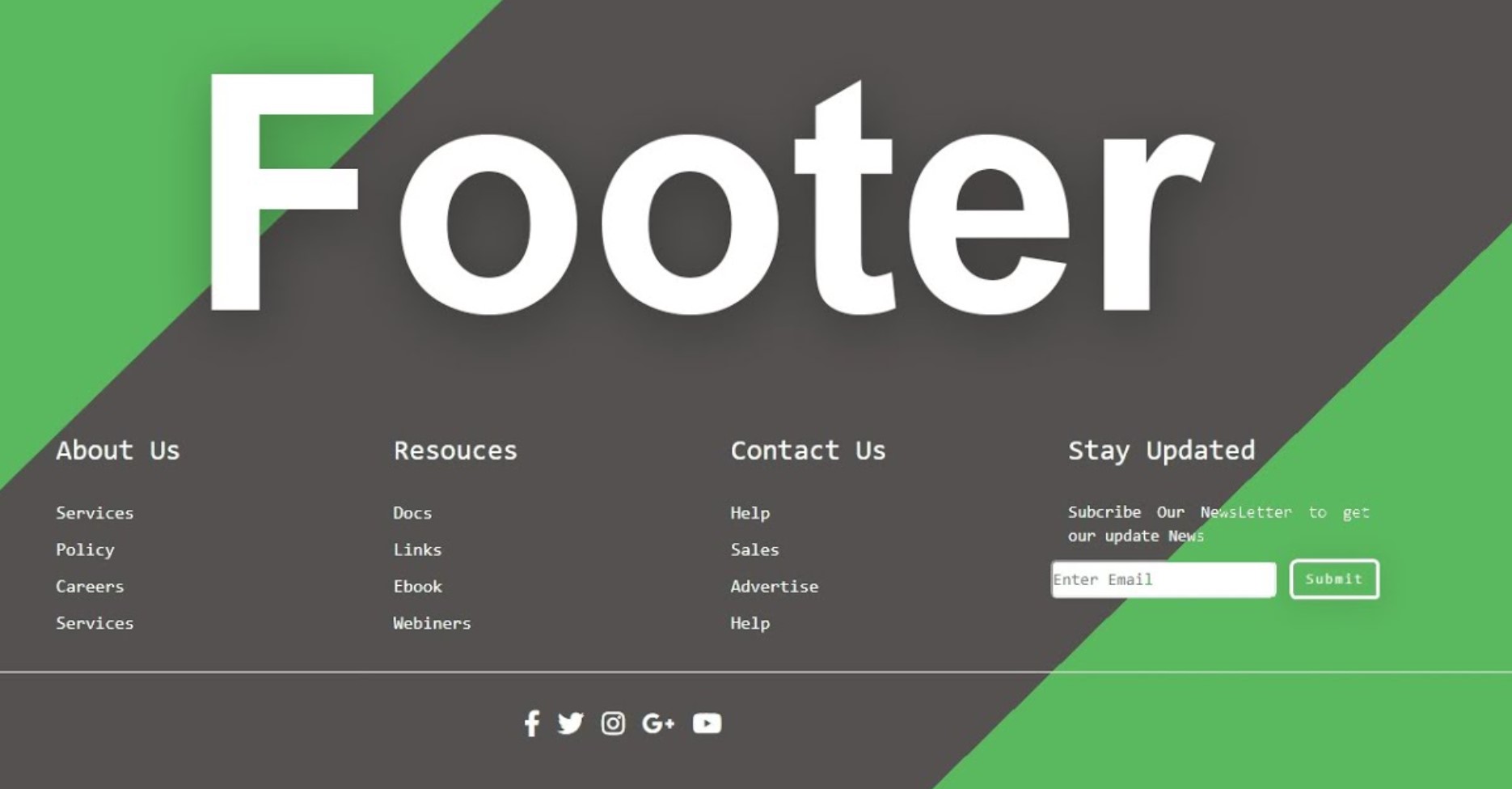
The footer should provide relevant and concise information that users may seek at the end of a page. Include essential links, such as the About Us, Contact, Privacy Policy, and Terms of Service pages. The information should be clearly organized, easily scannable, and visually appealing.
2. Contact Information
Including contact information in the footer is crucial for users who may want to reach out to the website owner or business. Display the business’s phone number, email address, and physical address (if applicable) prominently. This enables users to easily access contact details without having to navigate through multiple pages.
3. Site Map or Navigation Menu
| Site Map | Navigation Menu | |
| Purpose | Provides an overview of the website’s structure and content hierarchy. | Facilitates user navigation by displaying a list of available pages or sections. |
| Organization | Hierarchical representation of the website’s structure, showing parent-child relationships. | Categorizes pages or sections based on their content or purpose. |
| Level of Detail | Typically includes all pages and subpages of the website. | Can be customized to show only top-level sections or expand to show submenus. |
| Accessibility | Serves as a helpful resource for search engines and users seeking a comprehensive overview of the website’s content. | Offers a user-friendly interface for visitors to navigate the website quickly. |
| Visibility | Often placed in the footer or a dedicated “Site Map” page. | Usually located in the header or sidebar of the website for easy access. |
| User Interaction | Primarily used for reference purposes, allowing users to get a broad understanding of the website’s structure. | Actively used for navigation, enabling users to jump to specific pages or sections directly. |
| Updates | May require manual updates whenever changes are made to the website’s structure or content. | Can be automatically generated based on the website’s navigation structure or content management system. |
| Implementation | Can be presented as a hierarchical list, visual diagram, or a combination of both. | Often displayed as a dropdown menu, mega menu, or sidebar menu with various styling options. |
Both Site Maps and Navigation Menus serve distinct purposes in helping users navigate a website effectively. While a Site Map provides a comprehensive overview of the website’s structure, a Navigation Menu focuses on providing immediate access to specific pages or sections. It’s important to consider the website’s content, user experience goals, and design aesthetics when choosing the most suitable option for your website.
4. Social Media Links
Integrating social media icons and links in the footer enables users to connect with the website or business on various social platforms. This can help foster engagement, expand the website’s reach, and encourage visitors to explore more content.
5. Copyright Notice and Legal Information
Including a copyright notice and legal information at the bottom of the page is essential for protecting intellectual property and ensuring compliance with relevant regulations. This helps establish trust and credibility with users, especially in the case of e-commerce websites or platforms dealing with sensitive information.
6. Back to Top Button
Long-scrolling pages can benefit from a “Back to Top” button in the footer. This button allowsusers to easily navigate back to the top of the page without having to scroll manually. It enhances user experience and saves time, especially for pages with substantial content.
7. Responsive Design
With the increasing use of mobile devices, it is crucial to ensure that the website footer is responsive and adapts to different screen sizes. A responsive footer ensures that all the elements remain accessible and legible, regardless of the device being used.
8. Visual Hierarchy
Establishing a clear visual hierarchy in the footer helps users understand the importance and relevance of different elements. Use appropriate font sizes, colors, and spacing to differentiate between headings, links, and other content. This makes it easier for users to locate and engage with the desired information.
9. Limited Number of Links
While it is essential to provide relevant links in the footer, overcrowding it with excessive links can overwhelm users. Keep the number of links concise and selective, focusing on the most important and frequently accessed pages. This avoids clutter and improves the overall usability of the footer.
10. Consistent Design
Maintain a consistent design between the website header, main content area, and footer. Consistency in colors, typography, and overall visual style creates a cohesive user experience and reinforces branding. It helps users navigate seamlessly throughout the website, improving overall usability and user satisfaction.
11. Accessibility Considerations
Ensure that the website footer is accessible to all users, including those with disabilities. Use proper alt text for images, provide descriptive link text, and ensure that the footer is compatible with assistive technologies such as screen readers. Prioritizing accessibility demonstrates inclusivity and makes the website usable by a broader audience.
12. Performance Optimization
Optimize the footer’s performance by minimizing the file sizes of images, scripts, and other elements. This ensures that the website loads quickly, enhancing the overall user experience. Users are more likely to engage with a website that is fast and responsive, leading to increased conversions and lower bounce rates.
13. Aesthetically Pleasing Design
While functionality is paramount, the footer should also have an aesthetically pleasing design. Use visually appealing graphics, icons, and colors that align with the website’s overall branding. An attractive footer adds a professional touch and leaves a positive impression on visitors.
14. Test and Iterate
Regularly test the footer’s usability and navigation by gathering user feedback and analyzing website analytics. Use heatmaps and other tracking tools to understand how users interact with the footer and identify any pain points or areas for improvement. Continuously iterate and refine the footer based on user data to ensure optimal usability.


