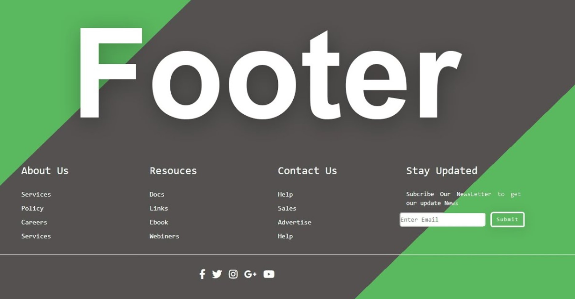
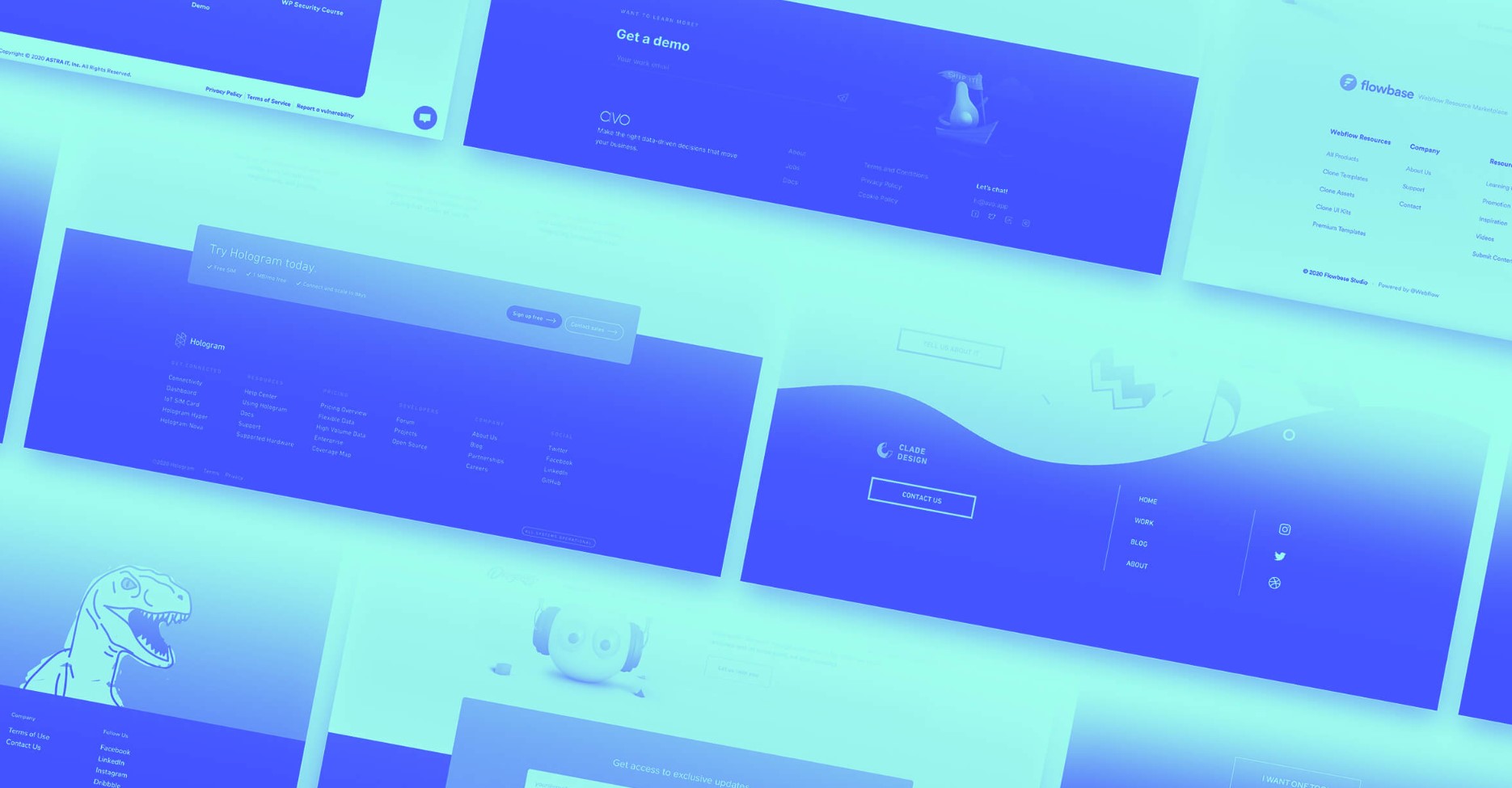
When it comes to website design, the footer is often an afterthought. However, neglecting the potential of the website footer means missing out on valuable opportunities to reinforce your brand and engage visitors. A well-designed and thoughtfully branded footer can leave a lasting impression and enhance the overall user experience.
Importance of Branding in the Website Footer
The website footer appears on every page of your website, making it an ideal place to reinforce your brand identity. It offers a final touchpoint for visitors before they leave your site and can act as a navigational aid. A cohesive and branded footer can create a sense of trust, professionalism, and credibility in the eyes of your audience.
Designing a Branded Website Footer
To effectively brand your website footer, consider implementing the following elements:
1. Consistent Color Palette
- Ensure that the color palette used in your website footer aligns with your overall brand identity. Consistency in color choice helps strengthen recognition and reinforces your brand’s visual presence.
2. Logo and Tagline
- Including your logo and a concise tagline in the footer can make your brand more memorable. It serves as a quick reminder of your brand identity and helps visitors associate your website with your business.
3. Social Media Icons
- Integrate social media icons in your footer to encourage visitors to connect with you on various platforms. This fosters engagement and extends your brand’s reach beyond your website.
4. Navigation Links
- Include important navigation links in the footer, such as About Us, Services, Blog, or FAQs. This enables users to find relevant information quickly, enhancing their overall browsing experience.
5. Contact Information
- Make it easy for visitors to reach out to you by including your contact information in the footer. Thiscan include your phone number, email address, and physical address. Providing clear and accessible contact information builds trust and credibility.
6. Copyright and Legal Information
- Incorporate copyright and legal information in the footer to protect your intellectual property and establish legal compliance. This not only adds professionalism but also reassures visitors that your website is trustworthy and respects legal standards.
Enhancing User Experience
A branded website footer can also enhance the user experience. Consider implementing the following elements to create a user-friendly footer:
· Clear Navigation
Ensure that the navigation links in the footer are clear and well-organized. Use descriptive labels that accurately represent the content they link to. This helps visitors find what they’re looking for quickly and easily.
· Site Map or Site Links
Including a site map or a list of important links in the footer can further assist users in navigating your website. This provides them with an overview of your site’s structure and allows them to jump to specific pages of interest.
· Call-to-Action Buttons
Strategically place call-to-action buttons in the footer to encourage visitor engagement. This can include buttons for subscribing to a newsletter, requesting a quote, or exploring your products or services.
· Newsletter Subscription
Incorporate a newsletter subscription form in the footer to capture visitor information and grow your email subscriber base. Offer incentives such as exclusive content or discounts to entice users to subscribe.
· Testimonials or Reviews
Showcasing positive testimonials or reviews in the footer can instill confidence in your brand and offerings. This social proof can persuade visitors to take desired actions and increase trust in your business.
· Important Policies
Include links to important policies, such as privacy policy or terms of service, in the footer. This demonstrates transparency and helps users understand how their data is handled, fostering trust and compliance.
Responsive Design and Mobile Optimization
Ensure that your website footer is responsive and optimized for mobile devices. With the growing number of users accessing the internet through smartphones and tablets, it is crucial to deliver a seamless browsing experience across all screen sizes.
SEO Considerations for Footer Branding
Optimizing your website footer for search engines can boost your online visibility. Here are some SEO considerations:
Keyword Optimization
Incorporate relevant keywords in the footer content to improve search engine rankings. However, avoid keyword stuffing and maintain a natural flow of language.
Structured Data Markup
Implement structured data markup, such as schema.org, to provide search engines with additional context about your footer elements. This can enhance the visibility of specific information in search engine result pages.
Linking Strategies
Strategically link relevant pages within your website in the footer to improve internal linking. This helps search engines understand the hierarchy and relationships between different pages on your site.
Monitoring and Iteration
Regularly monitor the performance of your website footer and iterate based on user feedback and data. Consider implementing the following practices:
1. Analytics Tracking
- Utilize web analytics tools to track user behavior, engagement, and conversions related to your website footer. This data can provide insights into areas of improvement and help optimize your branding strategies.
2. A/B Testing
- Conduct A/B testing by creating different versions of your footer to determine which elements and designs resonate best with your audience. Test variables such as color schemes, placement of elements, or wording to find the most effective combination.
3. User Feedback
- Seek user feedback through surveys, feedback forms, or user testing sessions. Understanding your users’ preferences and pain points can guide you in making informed decisionsto enhance your website footer’s branding and user experience.
A well-branded website footer can be a powerful tool to reinforce your brand identity, improve user experience, and enhance online visibility. By carefully designing and optimizing your footer, incorporating branding elements, and considering user needs, you can create a footer that leaves a lasting impression and contributes to the success of your website.
FAQs
- Can I use multiple colors in my website footer? Yes, you can use multiple colors in your website footer. However, it is important to maintain consistency with your brand’s color palette to ensure visual coherence.
- Should I include all pages in the footer navigation? No, it is not necessary to include all pages in the footer navigation. Focus on including the most important and frequently accessed pages to keep the footer clean and organized.
- How often should I update my website footer? It is a good practice to periodically review and update your website footer to reflect any changes in your branding, contact information, or legal requirements. Aim for regular updates to keep it relevant and up to date.
- Is it necessary to have social media icons in the footer? Including social media icons in the footer is beneficial as it encourages visitors to connect with you on different platforms. However, if social media is not a significant aspect of your branding strategy, you may choose to omit them.
- What is the significance of responsive design in the footer? Responsive design ensures that your website footer adapts and displays properly across various devices and screen sizes. This is crucial to provide a seamless user experience and maintain brand consistency across all platforms.


